
Website designer Simon Fong has been developing my Kimberley Lynne (KLL) website since December and he should have it up in a few weeks. Since I don’t need a 2nd general KLL website and my definition as an artist is more diverse than the crazy ghost lady author of my novel Dredging the Choptank (DTC), for the midterm, I’ll create a website specifically for the book, and that site will sustain the ghost blog I described in last week’s homework.
Simon’s design for the KLL website is black background towards bottom and photo of me across top in front of red with navigation buttons halfway between me and the text. I must ask him what fonts he used but looks like Times Roman. All the pages match the home page (home, works, about Kim, reviews, contact, shop). Text frame boxes are oriented to left with book cover icon to right. Do I match that format?
What is the goal of the DTC site? Direct people to readings, sell the book, sell the book, and sell the book. Where should the visitor’s eye go when they enter? To the book cover icon and link to Amazon?
Home page – Dredging the Choptank title in upper right header
- Background image of divine proportion spiral? A waterspout kills the book’s protagonist. There are national weather sites with tons of free images of tornadoes.
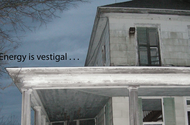
- What background color would pop out the book cover best? Black or red are too much like Simon’s design. A close up of the Blackwater swamp sky? The photo below from the back of Blackwater Refuge and a mile from most of the stories? An extreme close up of a Christ Church graveyard gravestone? All pages should have the same background.
- What typography? Match the Dredging cover? I must ask publisher Kevin Atticks about the book cover fonts. What color fonts? Straw to match the grass in front of the Howard House on the cover?
Description of the book in a text box to the middle left. Should the box be tawny to match the grass in foreground of the Blackwater shot?
Recent readings in another text box underneath that but offset.
Book cover with link to Amazon to the right, along with link to the YouTube book trailer.
4 Interior pages – navigation buttons across top and always there on every page. What do the buttons look like? Cartoon ghost? Skulls? Unevenly shaped clouds against the Cambridge sky? Labels: home, text, blog, history, contact, shop
Text page: a chapter of text (Chilled Wind Chapter Three, the reading one) and sound audio of me reading another chapter (maybe The What chapter.) I can record in the AV media lab or the theater. I had thought about a separate photo page but I think I’d rather scatter photo images throughout. On the text page, next to text frame, will be some photo of a Cambridge ghost locale: the Big Liz bridge, Hannah Madier’s grave in Trappe, the Christ Church graveyard, or Spring Valley.
Ghost Blog page: The photo of the Howard House from the cover at the top of the blog? Transfer the test ghost stories from this blog to that? Cajole friends to write their versions of their DTC book stories? Is that dicey? I need to talk to Greg Seagle at Towson about precedence of collecting folklore on blogs. The ghost tips from my pagan friend Korinne can be blogged because Korinne can blog as well.
History page: I don’t think my bio should be identical to the text on About Kim page in the KLL website. Maybe this history is more about the evolution of the book and my resume specifically as a writer? Place a photo of me at the Red Canoe reading in the middle surrounded by text? Does the text go in a spiral on this page?
Contact page:
Followed by a photo of me reading the book?
Links to:
· Apprentice house
· Kimberleylynne.com
· Red canoe
· UB Barnes and Noble
· The turning wheel
· CityLit
· YouTube and trailer
Across bottom of all pages: Copyright Kimberley Lynne 2010 All rights reserved

There are so many fun things you can do with a page on a Ghost Story! I like the idea of you putting a reading in the text section it makes it more personal and gives people a sense of you as a writer and performer.
ReplyDelete